The Donors' Fund
Background
Role: Jr. UX/UI Designer
The Donors’ Fund is a company and Donor Advised Fund (DAF) with the mission of giving the power and ease of giving, to it’s users.
These projects started with my own independent work, and evolved into a team effort with another Junior Designer on our team.
Each project went through numerous rounds of critique and variations and the final designs will be updated into the app and website.
Projects
Home Page Visual, Cancel interaction feature, and filtering Options Feature
Mobile Home Page Innovation

The original app home page
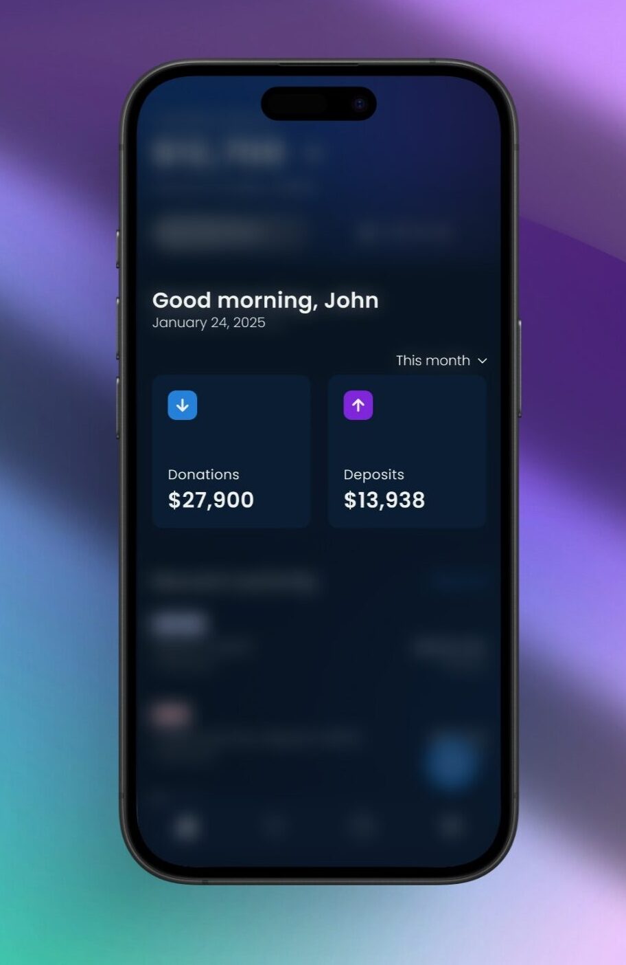
New home page
Project Goals
Home Page - Center Graphic on Mobile
The goals for the homepage were centered around the main graphic carousel when users log into their Donors’ Fund app account.
We wanted the user to see the most necessary information, in a more digestible way and in a concise and spatially cognizant composition.
The information that needed to be included were as follows:
1) The user’s deposits
2) The user’s donations/giving
3) All the above information filtered by daily, monthly, and yearly transactions.
The graph and carousel was shown to be too much for the eye to digest, so I brainstormed some new ideas and came up with a variety of new designs to replace the center graph carousel (as shown in the image to the left).
Solutions
By keeping the goals for this project in mind, I realized that the homepage had previously had a lot of extra unnecessary information.
The new design showcases the icons that represent the donations and deposits into your account that are consistent with The Donors’ Fund branding. The coloring and iconography needed to display the purpose simply, to allow the user to correlate them to their necessary functions throughout the interface.
Placement
When it came to the placement of the information, my coworker and I worked together to create a dynamic visual hierarchy, and a cohesive composition for the carousel cards.
We had to be mindful of the size of the cards, as it is being implemented into a mobile app and everything taking up space needs to serve a purpose. Starting out with larger cards, we shifted around and consolidated the information, and came out with a dropdown menu, one icon per card, and two lines of information shown. This showed to be the best use of space, without adding unnecessary information – which would also show to be unnecessary when creating this ‘glance/summary’.
This is where it was important to refer back to the goals of the project – a simplified version of the original information while displaying a digestible summary.
Menu Choice
The dropdown menu felt the most intuitive, spatially cognizant, and necessary as the ‘daily’, ‘monthly’ and ‘yearly’ information would be filtered easier with that slight adjustment. Originally, we had the dropdown menu inside of each card, but with slight adjustments, we were able to create a better composition by putting the dropdown outside of the cards, still having them associated with said information. This also added a level of ease for the user to see both data points change at once, and not have to change them both manually.
Hierarchy
When it came to relationship between the typography and icons (donations and Deposits), we felt it more necessary to make the totals, bolder than the titles. This way, they would start to regularly associate the color and icon with the number, as opposed to having the focal point be the title of what the number represented. This way, the user can also see the most important information on a glance, and not be distracted by the title of the cards.
Future Innovation
Lastly, as we were designing the cards, we left room for future innovation. Perhaps there will be future updates where they may need to add more cards to the carousel. If any other cards need to be added, the auto layout details can be easily adjustable to show the next card slightly, showing the ability to scroll.
‘Cancel Interaction’ Feature
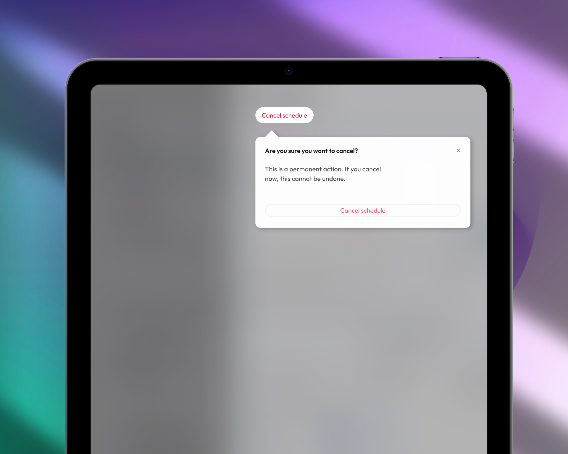
Background and Project Goals
In the original flow of canceling a user’s (future) scheduled payments, the user would press the ‘cancel schedule’ button, and the schedule would be deleted. The goal for this project centered around creating some friction between those two actions, so that:
1) The user would have the ability to go back, in case they made a mistake
2) The user will have the ability to go back if they choose not to cancel anymore or rethink their action – which is also what The Donors’ Fund would prefer.
It creates that extra step and mindfulness so that hopefully, they’ll choose the right choice for them.
After researching and coming up with many ideas and designs, this was the solution. After careful consideration, we chose this as the final cancel interaction design.
The main points that I focused on for this interaction were the placement and hierarchy of the design.

Feature placement on screen
Careful Considerations
Hierarchy
As a company, we don’t want our users to be canceling their interactions, and when it comes to a more simple design, hierarchy is one of the biggest things to consider.
We want there to be a button for the action, as there will be times that the user wants to cancel their schedule, but we don’t want it to be so bold that it’s the first thing they see when logging into their account. That being said, the button was carefully branded to be legible, but not at the top of the hierarchy.
Sometimes, when creating simpler designs, I found that less is more, and only adding what’s necessary will create a better design without overwhelming the user. Therefore, there is an ‘x’ to leave, the button that allows you to move forward with your action, and the simple instructions clearly stating what you are going through with. This confirmation allows for the mindfulness of the user, and doesn’t have unnecessary ‘extra’ steps or elements.
Lastly, I chose a left alignment as the center alignment showed to be unattractive for the amount of text we had in the popup.
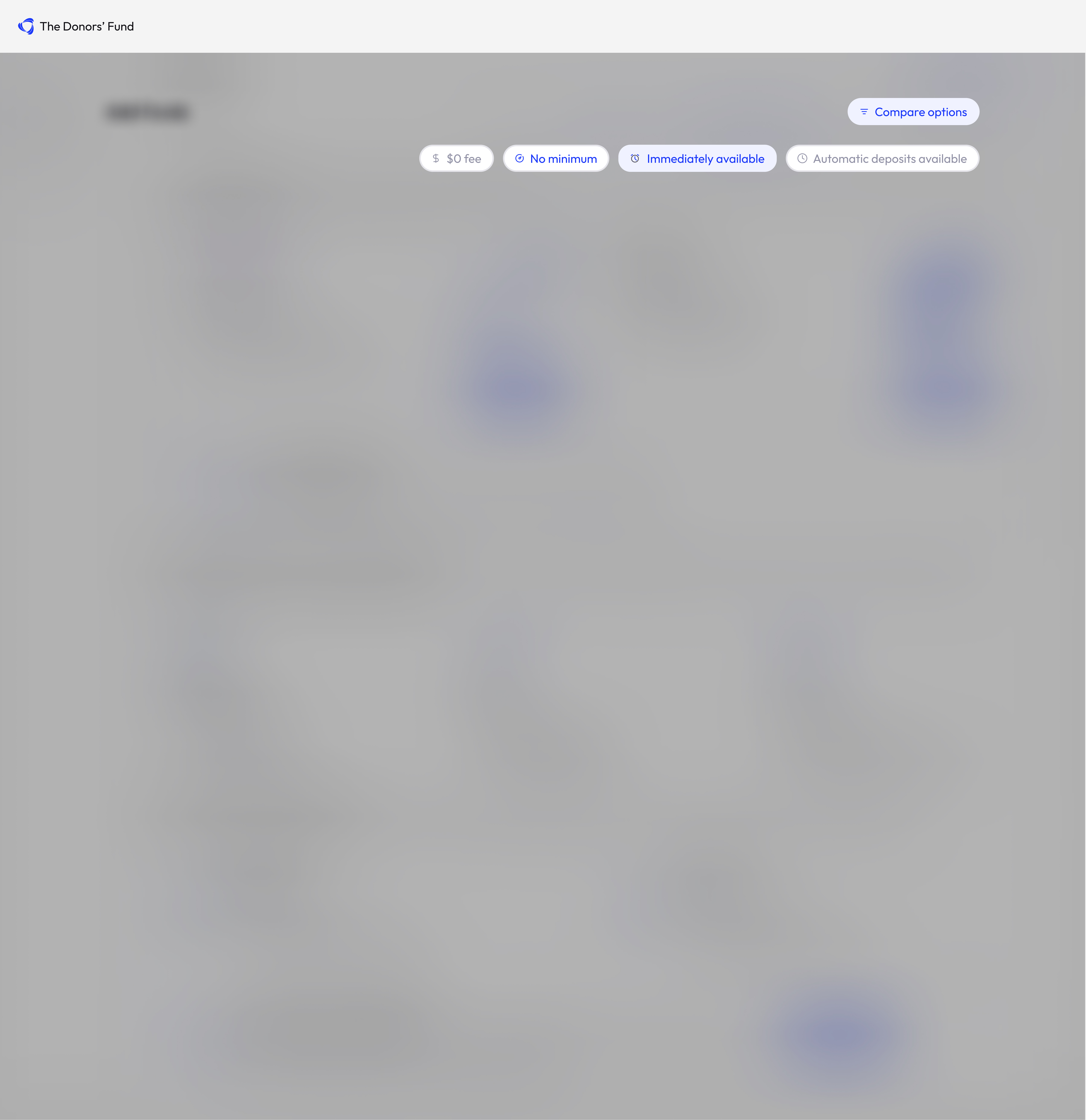
Filtering Options Feature

Filtering options placement on screen
Background and User Goals
The last project I had a hand in working on was a ‘Filtering Options’ feature. This design would assist the user to filter the characteristics of multiple transaction types.
This project was centered around the filtering options at the top of the screen when users sign into their account.
The main goals for this project were:
1) Consolidate the information into an easily digestible feature.
2) Make the feature easily understood to all experience levels – new and existing users.
3) Spatial recognition of the interface and consolidate the information to a smaller area of the screen while still having the necessary information come up.
Filtering solution isolated
Solutions
Consistency within the interface
To begin with, I kept everything consistent with the branding of The Donors’ Fund. The colors were significant as I needed them to represent their capabilities while also showing the options that cannot be or were not selected.
For example, if ‘$0 fee’ doesn’t apply to the same kind of transaction as ‘No minimum’, they cannot both be selected at once, so the colors should display that.
There were 3 options for the buttons:
1) A clickable button that would be white in background, and blue typography/iconography
2) An already clicked button that would display as a blue background and blue typography/iconography
3) An already clicked button that would be grey in background and grey in typography/iconography
Spatial Considerations
when designing this feature, I wanted to take into consideration that this feature would be implemented into all format sizes. Therefore, I created the design to drop down from the ‘compare Options’ button in the original header design. This works great for all users because:
- For new users: Once the button is clicked and the options drop down, they can select the options as needed – which also assists in teaching them the transaction types.
- For existing and experienced users: They don’t have to select anything if they don’t want to, and it isn’t constantly taking up real estate on their screen. It is there if they want the option, but not taking up unnecessary space.
Personal Reflection
Along with the projects above, I had a big hand in the responsiveness of the app and website and was responsible to format the interface accordingly. Along with the responsiveness, I also worked a lot on the UI Kit and created numerous elements for the interface that would then be put into the responsiveness work I had done.
I got to experience first-hand how design correlates to real world examples and users. My growth at The Donors’ Fund was nothing short of excellent and I got to work in many areas of UX/UI which is not always common so early on in one’s career.
There were a few major patterns that went into the designs I created such as:
- Creating friction when necessary
- How to go about each step of the process when creating responsive designs
- How to integrate the responsiveness throughout variations of size and format
- What gravitates your users towards your designs in the real world?
There are so many natural and intuitive questions that come up from the users perspective, and getting to have a hand in the full process allowed me to get a well-rounded experience working from the side of the user, and the interface progression.
I appreciate and enjoyed my time and ‘mentorship’ at The Donors’ Fund and the team I worked with. My overall skills with the design process and interacting with coworkers throughout, gave me a greater sense of what it is like to be part of a team. We worked to better the experience of others, and kept in mind the company’s mission, and overall upward trajectory.